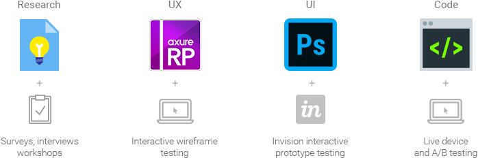
Interactive prototype vs finished design
Bloom & Wild Website and iOS App
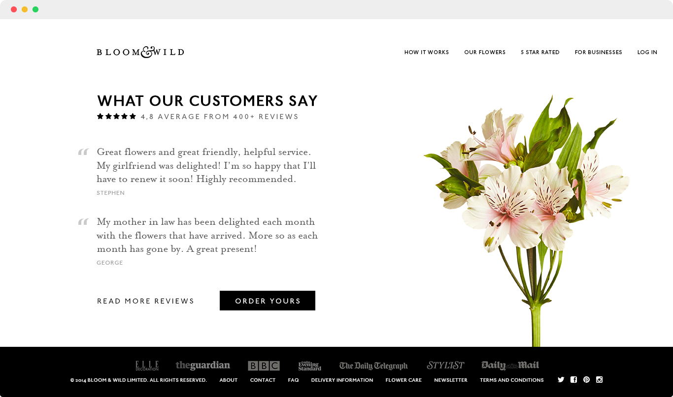
Bloom and Wild is an online florist that allows one-off purchases and subscriptions for quick, through-the-letterbox bouquet deliveries, via their website and apps.
I was brought in to redesign the website and apps from the ground up. I began by setting up a cycle of research, design and testing, which led to a data-driven re-imagining of the user experience.
I then created a new visual design, working closely with the developers and the branding team to deliver a consistent, cross-platform experience that embodied the values of the company.
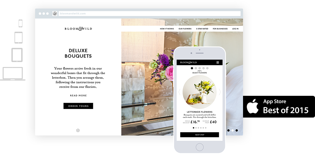
Shortly after launch, the iOS app was selected by Apple as one of the Best Apps of 2015.
Requirements and planning
I began with an effort to understand the business and their goals. Together, we set out research objectives and outlined core assumptions to test about the product and its audience.
We structured the project through a string of meetings and workshops, attended by key stakeholders including marketing, sales and developers. My role was further defined in the process as a hybrid of UX and product management.
- Methods: Meetings, workshops, card sorting
- Results: List of purchasing patterns, List of user needs, Lessons from similar services
- Deliverables: Personas, Information architecture v0.1, Revised KPIs, Revised feature matrix
Research
In the research phase, I turned to data and users themselves to test our assumptions. A notable discovery was a fairly counter-intuitive correlation between our users’ gender distribution and purchasing habits – which we successfully confirmed with interviews, and fed into the final list of personas, as well as the overall marketing strategy.
- Methods: Competitor Analysis, Analytics Review, User Interviews, Card Sorting
- Results: List of purchasing patterns, List of user needs, Lessons from similar services
- Deliverables: Personas, Revised Information architecture, Revised KPIs, Revised feature matrix
User Experience
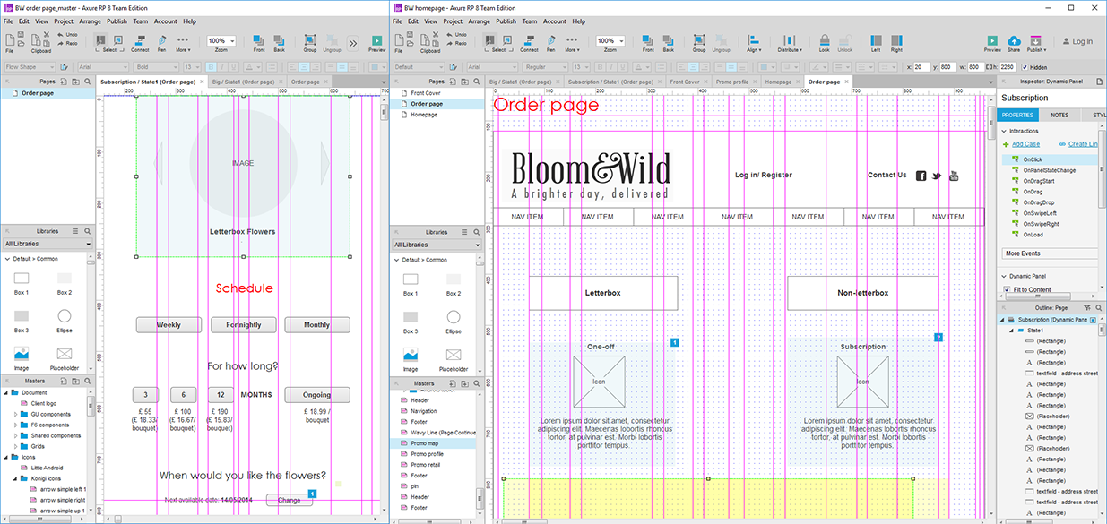
In this phase, the research was fed into an iterative design process which produced dozens of sketches and interactive prototypes.
I worked closely with the developer team to select the appropriate front-end stack and ensure that every aspect of the interface I was building would be optimised for speed across devices. With their support, I was able to create a content-driven responsive UI pattern. This did not rely on traditional device sizes and breakpoints – instead, the UI was designed to reflow smoothly and fit any and all screen/viewport sizes, without having to target any specific device.
Finally, we ran our prototypes through several cycles of testing before pushing forward to the visual design phase.
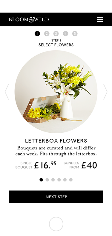
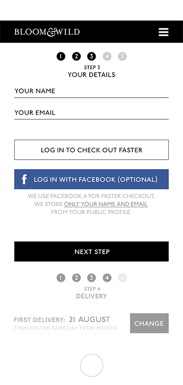
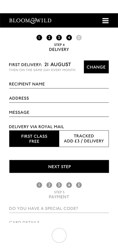
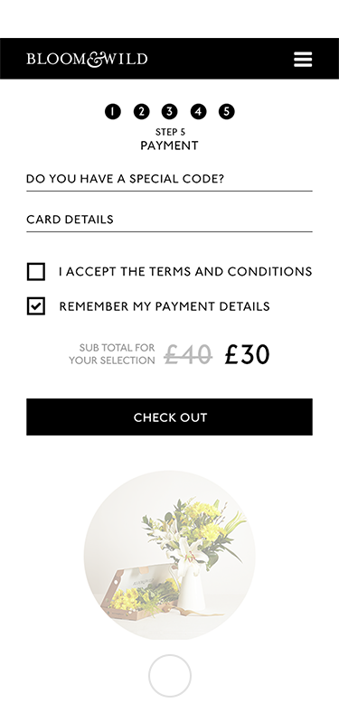
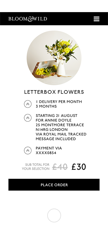
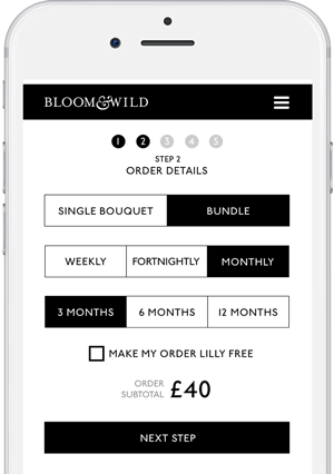
The checkout process was a highly successful experiment. It supports multiple purchase patterns with rigorous optimization and a significant reduction of complexity on the user side.
Read the Case Study
With a dynamic, experimental checkout process at the centre of the user experience, the homepage and a number of spin-off landing pages were designed as frictionless entry points to the conversion funnel. This phase of the project delivered:
- Information architecture
- Interactive prototypes
- User journeys
- Wireframes
- User testing
- Sketches
Visual / UI Design
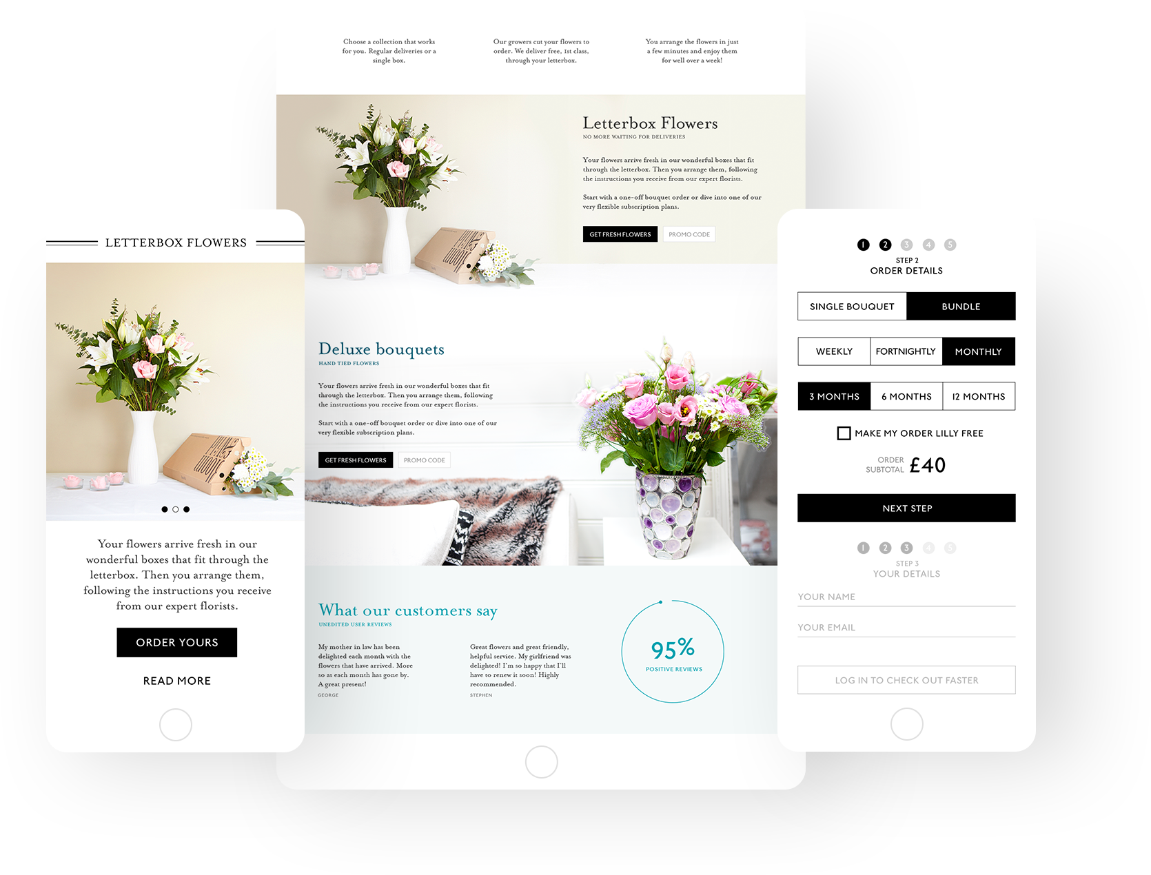
Responsive design reflows to fit any device size.
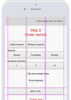
The next step in the checkout is visible but grayed out until the “Next step” button is pressed.
The visual design part of the project was the result of close collaboration with the development, marketing and branding teams. I began by creating a consistent visual language that reflected the brand’s style and values. After extensive testing, I arrived at a standardized UI Kit, which included:
- An exhaustive library of UI elements
- Typography rules
- instructions and guidelines (both technical and design-oriented)