Anatomy of a Checkout

An in-depth view at the web and mobile checkout system of Bloom & Wild

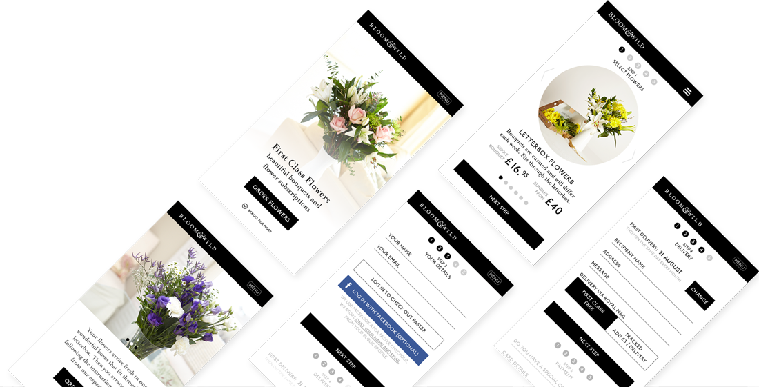
My priority was to make the checkout as quick and seamless as possible. This was a challenging task due to the relative complexity of the product offering.

I began by visualizing a matrix of all the order variables:

  • Product type: bouquet A, B, C, D, etc.
  • Delivery type: through the letterbox / large package.
  • Order type: single bouquets / multiple bouquets (scheduled) / subscription (scheduled).
The ideal was to create a single checkout process that gives the user access to every possible combination of variables in a simple and straightforward way. This needed to account for further complexities:


  • The variables are inter-dependent
    eg: choosing letterbox delivery restricts the choice of bouquets / choosing a certain bouquet restricts the type of delivery available
  • Each variable determines a different set of fields in the checkout process
    eg: a subscription requires advanced scheduling options (a calendar UI element plus other fields that are not needed for a single delivery)
  • Each variable affects the price
To remove this burden of complexity from the user, I decided early on that it would be best to hide non-relevant fields dynamically in the checkout page. Therefore, as the user progresses through their order options, the form reshapes itself on the fly and out of sight. I achieved this by:


  • Arranging options in such a way that a user choice will never impact a variable above their current position in the checkout page, so that the user is never surprised by a change they made, and never needs to scroll back up.
  • Creating the impression of simplicity by splitting the order page into sections and allowing only one section to be “active” at a time – the others being grayed out, but still available by scrolling, if needed.
  • Always maintaining the price in sight, so that the user understands how each change impacts the final cost.
These choices were constantly tweaked and verified with in-house testing, analyses of user behavior patterns on the old site and finally with a round of user testing driven by interactive wireframe prototypes on desktop, tablet and mobile. The checkout process was further optimised with a set of “quick wins”:


  • An address field that required the user to only enter a postcode and automatically displayed a list of addresses to choose from
  • A credit card field that only required the credit card number and CVV code, and inferred the rest of the details (type, date etc) from the number
  • No account creation prompt: the details needed for the order were more than sufficient to create a custodial account, which could be claimed by the user at any time from the order confirmation email

Finally, the homepage was designed from the ground up to support and feed into this checkout process. Each section of the homepage highlighted a different variable of the product offering, such as letterbox shipping, a certain bouquet or weekly subscription options, for instance. These variables were selected by researching the most popular order types.

The call to action for each homepage section then led to the checkout page with that specific variable already set. This sped up the order process significantly, while still allowing the user to switch to a different variable, if desired.

Eg: click on “order one-off bouquet with 1-day delivery” section – go to the checkout page with that option already set. No subscription-related fields appear on the page.