I joined MyGravity as Head of UX at a time when the product suite was still being defined.
In this idea stage, I helped set up a cycle of in in-house workshops, interviews with future customers and research sprints. Together, we created a release schedule for each product, with synchronized milestones to deliver a functional MVP that would develop into a mature suite of products over the coming months.
Methods
- Workshops and meetings
- Competition research
- User interviews
- Card sorting
Results
- Hierarchy of customer needs
- A prioritized list of features (starting at MVP)
- A synchronized cross-platform roadmap
- Quick wins and “nice-to-haves”
- A growing list of challenges and risks
- User personas
User Experience
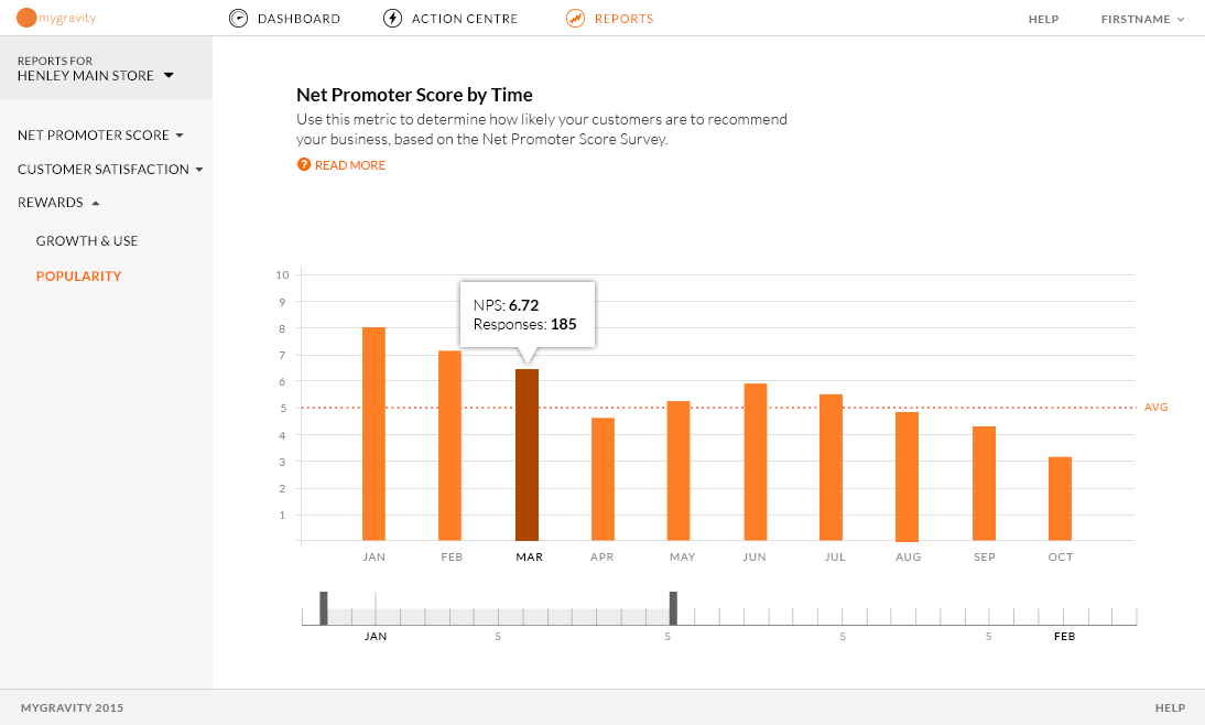
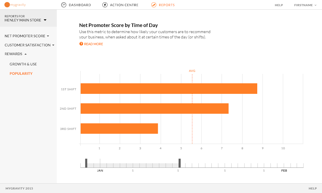
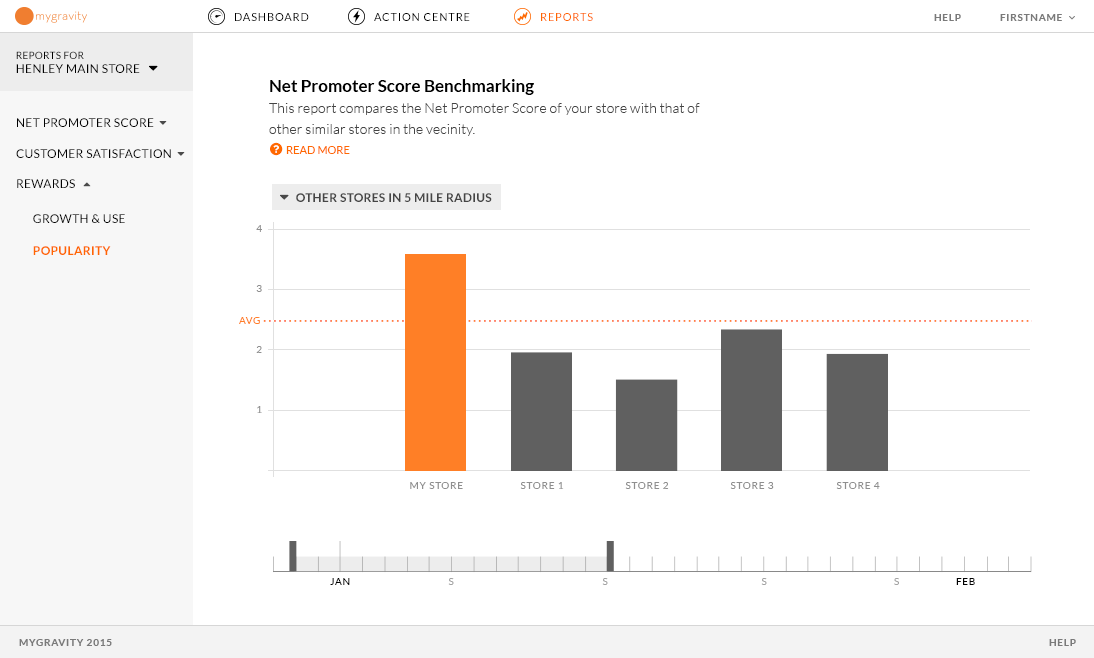
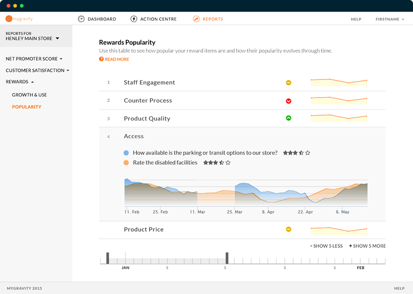
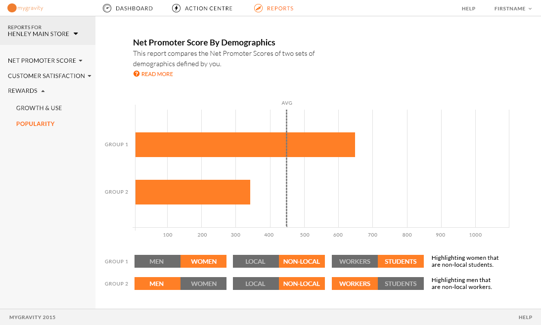
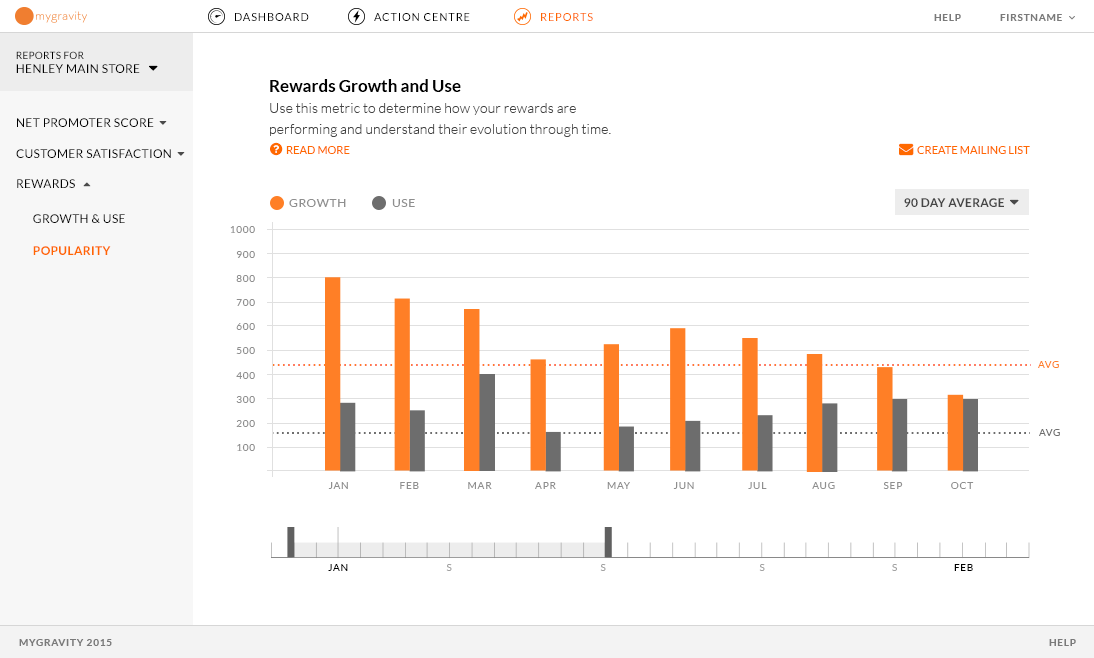
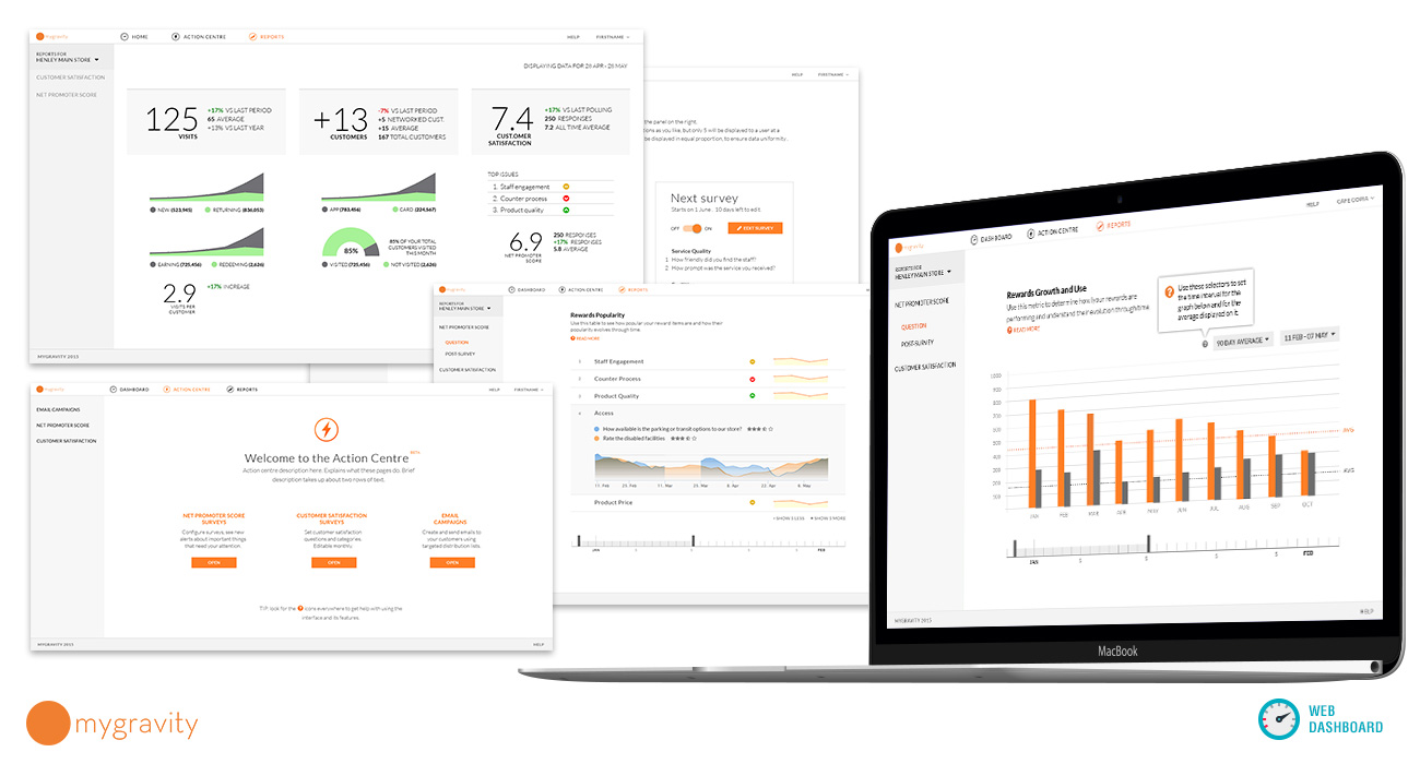
The Analytics portion of the customer web app presented some interesting information architecture and data visualization challenges. Due to the flexibility of the service, a large number of variables were in play, and the resulting data needed to be displayed in a clear, actionable and clearly manipulable way.
- 6 data categories
Net Promoter Scores, Customer Satisfaction, Demographics, Reward usage, Footfall, Competition benchmarking. - 8 types of report at MVP
with more to follow
- 3 types of loyalty user
paper card / app / mixed use - 2 core user personas
basic / advanced user - 6 types of store configuration
- 3 types of loyalty scheme
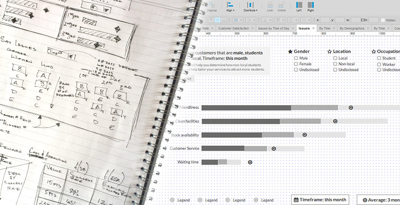
Starting with paper prototypes and a list of assumptions to pursue, we carried out a series of user interviews, speaking to future and potential customers, company stakeholders and various small business owners that had registered an early interest in the product suite.
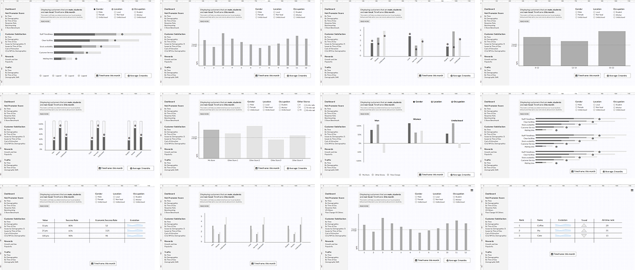
I then produced interactive wireframes that we tested for usability and clarity. I paid particular attention to testing the data manipulation controls, which needed to remain as consistent as possible across very different types of graphs and visualisations.
- Methods: Sketches, Paper prototypes, Internal workshops, User interviews
- Deliverables: Information architecture, Interactive prototypes, User journeys, User personas
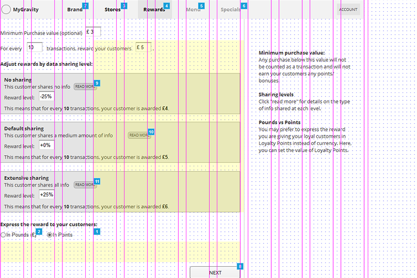
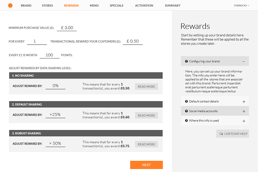
Finally, I designed and tested the onboarding process, which attempted to simultaneously gather the necessary account information, explain the service and its options, provide insights into how to configure and run a loyalty scheme in general (and on our system in particular), and subtly introduce the user to the dashboard interface.
Visual / UI Design
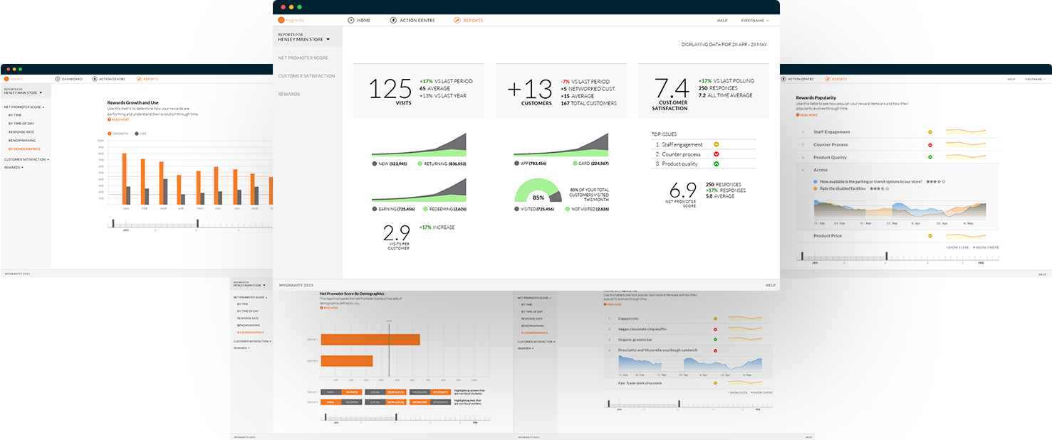
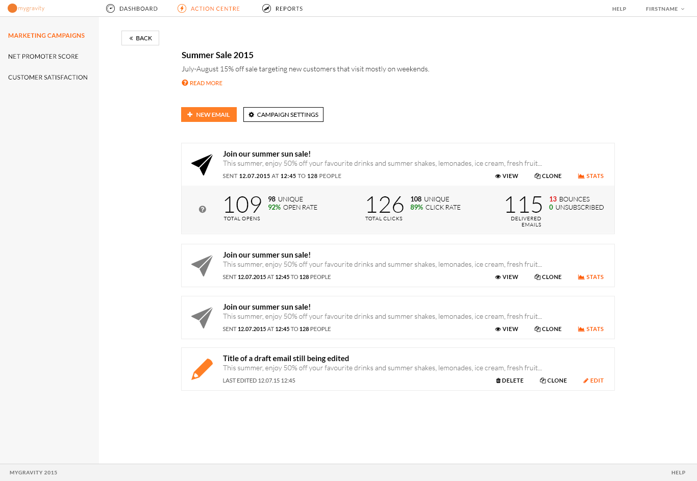
Main dashboard allows quick access to key metrics
Consistent UI elements and graph controls allow intuitive data manipulation
I created the UI design in close collaboration with the developer team. I began by developing and testing a UI kit of flexible and responsive interface elements, which could be recombined quickly to create new designs, as the products developed.
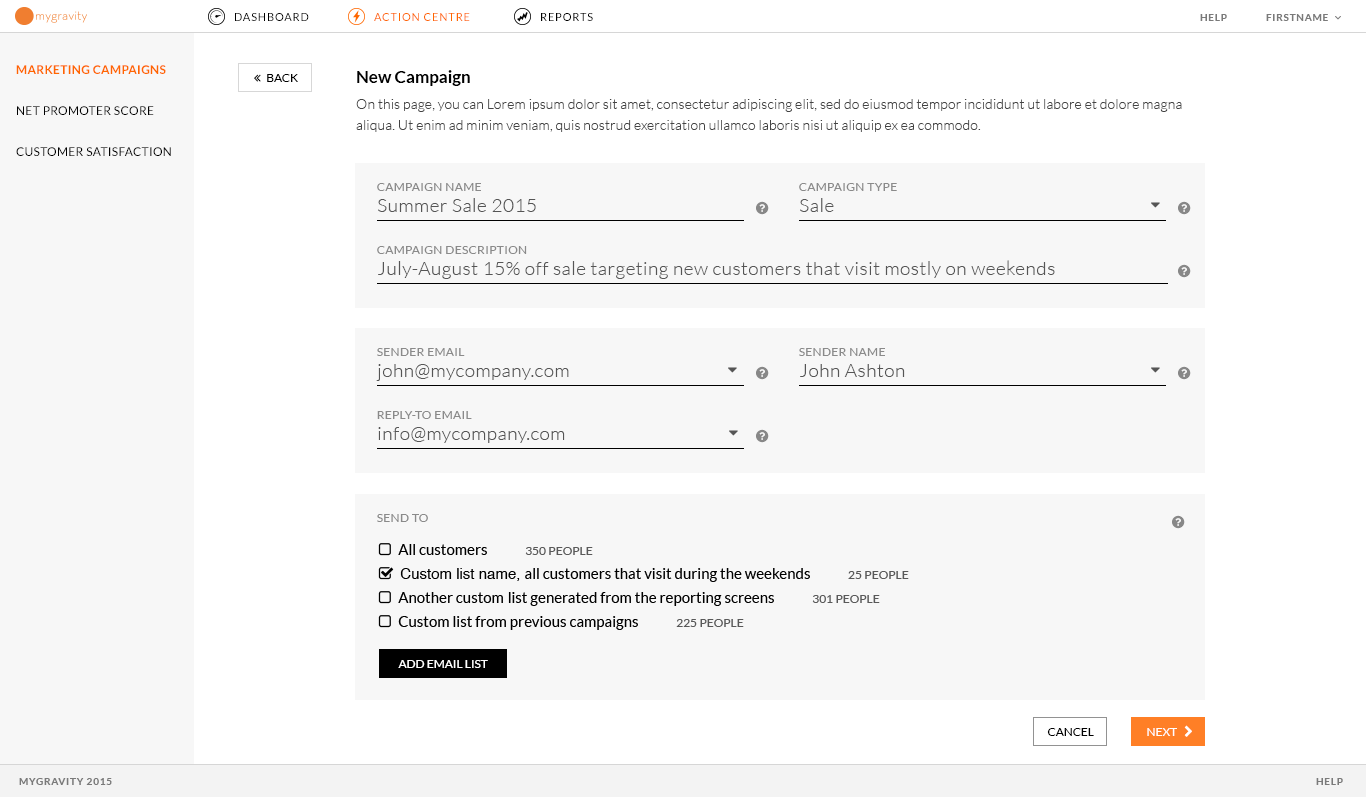
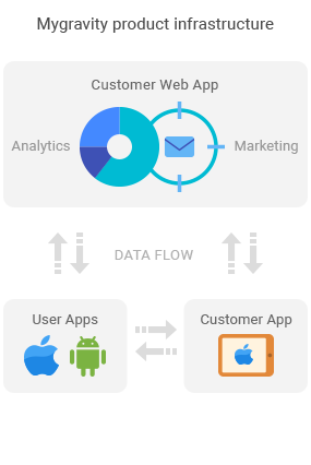
Although the analytics and marketing / targeting sections of the product suite are separate from a system architecture point of view, there are many crossover points (for instance, user segments can be selected from the analytics portion and saved to lists that can be targeted by individual, custom campaigns). This meant that from the user’s point of view, the system had to appear as a single, consistent and coherent whole. This was one of the major focuses of our testing sprints, and became a top priority in the design of the UI.